The Engraving Process: Layout & Job Design
Welcome to the JPPlus Resource Center!
Your resource for support for: Engraving | Sublimation | Toner Heat-Transfer | UV-LED & more!
Once you have obtained the design elements, bring them into the engraving layout software. Tell the computer all the job-specific options (plate size, file name, etc.), then place your text and graphic elements into the job. Once the plate is defined and the objects are positioned, you can select any special options such as serialization, multiples or columns and then send the job to your engraving controller. Engraving software gives you creativity options. High-quality engraving software packages give a wide variety of layout options, set forth in simple and quick-to-use methods.
I've often said that once a person masters the basics, any job can be tackled. The only difference then is the experience. The next few steps will show you just how easy the basics are. There are a few factors to consider when setting up any engraving job. The principles below need to be considered in almost any layout, given that most jobs can be approached in the same manner and must include the same basic elements.
Here are the critical factors that apply to virtually any engraving job and must be determined to some degree to start any layout:
DETERMINE THE PLATE SIZE OR ENGRAVABLE AREA.
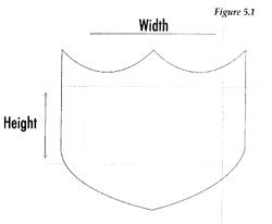
For many applications, the size of the object or precut shape will determine the available engraving area. If it is not defined by the object's shape, you may have some latitude in choosing the overall plate size. For square or rectangular shapes, a simple length and width measurement is taken. For more complicated shapes such as gift items, there are several approaches to get a useful measurement for layout purposes. Many of these will be discussed in greater detail in chapter 7. The beauty of computerized engraving and the more sophisticated software programs available today is that we can move the text or graphics to the area where we need the engraving to appear.
With many odd shapes (as in Figure 5.1) we may choose not to consider outlying areas as engravable space. This can help to simplify the layout and design. The drawback is that we must now consider something other than the physical edge as our plate border.
DETERMINE THE MARGINS
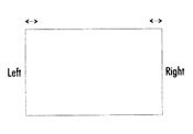
In a square or rectangular shape, the LEFT and RIGHT margin for many layouts can be simple. If the engraving software you use does not automatically suggest a margin, a percentage of the plate width may be applied. There are not hard and fast rules to go by, but I recommend about 15% of the plate's width, give or take 2%. Divide this by two and apply to each side of the object for a balanced appearance, i.e. about 7.5% to 8% per side. Most engraving software programs will apply a set shape that can be modified in the layout by the user.
The TOP and BOTTOM margin is a bit more difficult to determine. In some shapes, it may be appropriate to apply a top and bottom margin that is similar to the left and right. This is not always the case in name badges or plaques that have an unbalanced text or graphics and the proportion of margin may be as high as 1/2 of the overall plate height. The examples on this page highlight the relative differences based on the type of object and size of the text area.

DETERMINE THE BASELINE
In computerized as well as manual engraving, determining the proper baseline is one of the most critical factors to creating a balanced and eye-appealing layout. The baseline is measured from the top of the plate to the bottom of the text or graphics. It's the imaginary line that the characters rest on as measured from the top of the plate. Determining the baseline for each line allows us to properly space the lines in a multi-line application such as a plaque.
Thank goodness that today's software packages do most of these difficult calculations for us. Imagine having to determine each line of a 40-line plaque where the line heights vary and line to line spacing is different. If you use a computerized system, many times you will be able to use the suggested baselines. From time to time, you will need to modify the baseline to improve the layout's appearance or allow for appealing graphics.
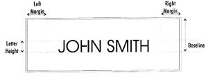
Since all measurements to determine the location of the engraving are taken from the top of the plate, set-up of difficult shapes can be simplified. The figures will show various suggested baselines and measurement for some common objects.
DETERMINE THE LETTER HEIGHT
This should be a simple process, right? Unfortunately, this is not always so, given issues like how much engravable area is available, the amount of text required, and the style of the font needed for the job. There is a relative relationship between the amount of engraving required and the size of the engraved character and the application will often determine not only the method of engraving but also what character size limitations we have. Imagine a letter several inches tall that has been diamond-dragged. Due to the narrow stoke of the diamond, the words would not appear attractive and would be difficult to see on a plaque or sign at any distance. Letter height and cutter sizes are interrelated, and cannot be ignored in a good layout. A well-stocked engraving shop will need to have a broad line of cutters available, so it's better to select the letter size first and then use the appropriate cutter for the job.
Also, if the job is to be aesthetically attractive, and the engraving readable at a distance appropriate to the object, then the size of the engraving relative to the object must be determined. Several objects are shown in their actual size. The dimensions in these illustrations are given as a reference only. Each job is unique and I can only offer general advice.
With these four critical elements defined, a good layout can be done. The only other factors that can further influence the design and layout are the material, font style, and engraving process. With experience and a little practice, it will become evident how to approach even the most complicated piece.
CHOOSE A FONT STYLE
No, I will not try to tell you which font to use in any given job - technically no one can. It is a matter of personal choice. Now that I have successfully dodged that question, we can move on.
The selection of a font or letter style is more of an issue of matching the font to the object or occasion. Items such as wedding knives or baby gifts may look better with a script font. Many plaques and trophy plates are done with a Roman font, the 3-Line version being very popular and a standard part of most engraving software packages. Signage may use a Helvetica, while a man's gift item like a lighter may be monogrammed or engraved with an Old English letter style. The subject of font styles and their uses in different applications can hardly be covered in one book, let alone in a very short chapter. I suggest checking with the local library if you have questions about what font to use to achieve the effect desired. I also suggest reading the articles in National Business Media's A&E Magazine by Mr. Bob Trogman, affectionately known as "Dr. Type". Bob shares his wisdom and insight in the proper selection of fonts for different jobs.
There is another point worth mentioning here. Engraving fonts as supplied by the equipment manufacturers are generally going to engrave faster than true type fonts. Engraving font tool paths are optimized to increase the speed at which they will engrave. True type fonts are usually outlined only and must be filled in another program if you need something other than just the outline. The fill routines used to achieve that filled letter for rout out will take longer to cut than the equivalent engraving font if it does exist. Most engraving system manufacturers can provide an adequate library of letter styles, usually about 50 high-quality fonts. These, of course, will be the most commonly used. If you do need to match a font style, perhaps as part of a logo, you will need to either create the logo text as a graphic or substitute the font from a library of true type fonts.
A few of the fonts on my "must-have" list (although, this is by no means complete, and a lot of it will depend on your own preferences) are: Block, Century, Connecting Script, Gothic, Helvetica 1- and 3-Line, Old English, Optima, Roman 3-Line, Times Roman, and Utility.
COPY LAYOUT
The layout of the text or "copy" may be one of the most important elements of a visually effective design. After the font style, material and method of engraving are selected, copy becomes a major factor in determining the overall look. If the customer does not specify any strict requirements and affords you a reasonable amount of latitude with the layout, you can create a simple yet attractive appearance. Two key items need to be considered: how much text is required to achieve the desired message as well as how to acknowledge the recipient. On items such as pens, key rings, letter openers, lighters, and baby gifts, the message may be as simple as initials, a name or greeting and date. On larger items, a poem or catchy phrase may be used. On plaques or awards, several major elements come together to enhance the overall look. These include graphics, the giver's name and, in the case of a corporate award, the company logo.
More is not necessarily better in engraving. Keep messages simple and the engraved area uncluttered. Often customers try to place too much text into an area that was designed for a simple message, names, and date. Keep the number of fonts used to a minimum. Too many different letter styles used together can make the piece look poorly designed and hard to read. If the engraved area looks naked or the object lacks an attractive natural background or border, try adding a border or ornament to liven up the appearance. A single ornament can break up paragraphs or place emphasis on a particular element of the layout.
COLUMNAR LAYOUTS
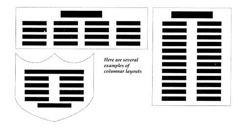
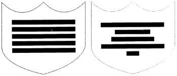
Large items can be especially challenging if they have several recipient names. A common practice to balance the layout and acknowledge special classes of award is to create columns. A columnar layout can take many forms based on items like the number of names, classes of award like first place, second place, etc., whether the text is centered, left or right justified, and if abbreviations may be used.
There are several uses for columnar copy. These represent some common uses, however, it can also be a useful tool in setting up large amounts of copy or creating a unique look even when columns were not originally considered in the design:
- Perpetual Awards
- Dedication Plaques
- Sports Awards
- Donor Plaques
EVALUATE THE ENGRAVING AREA
This is slightly different than that of determining the engravable area I mentioned above and an important step to consider. The overall shape of two items may dictate different arrangements of text and graphics even when the amount of engravable space is equal.
Some shapes will lend themselves to a structured appearance such as rectangular plaques. If the plaque or award is vertical (tall and narrow), then a few columns with many names may be the answer. If the plaque is a horizontal design (short and wide), then several columns containing fewer names may be appropriate. The figures on this page show several engraving area shapes and possible column layouts.
EVALUATE THE COPY
The next step is to evaluate the copy itself. There are several ways to organize the names if the customer does not specify it for you. For example: alphabetical by last name, or chronological by date just to name two. If the item is a donor's plaque, it may be appropriate to list the names by size of contribution. Military awards can be arranged by rank or date of service. Once the order is determined, most plaques will have the lists of names sorted in order of importance from left to right and top to bottom.
Another consideration that can affect the decision to use a columnar layout is the length of the longest name. Oftentimes it is important to shorten this by using first initials. In the case of donor plaques or awards, titles may be used such as Dr., Mr., and Mrs., followed by the first initial and last name. Most military awards will be given with the recipient's military rank such as Cpl., Sgt., or Lt. (Corporal, Sergeant, or Lieutenant). Before making any final preparations for engraving, check and double check these abbreviations with the customer to insure that they are appropriate and that they are correct. It is a wise practice to request a written list from your customer to prevent misspelling of names, and double check them after they are in the layout, and before engraving.
LAYOUT FOR MAXIMUM EYE-APPEAL
Approaching a layout design can be an exciting challenge. Creativity is certainly one of the many reasons people select engraving as a business. Developing your own look and adding design elements that you find attractive can not only give you pleasure but can help to insure many new and loyal customers.
One of the challenges engravers are sometimes faced with is finding the right words for a gift item or plaque. One could argue that selecting the words has nothing to do with the design, or does it? Knowing what you need to say, how much area it may take up, and what kind of traditional look it could have, are very important parts of creating an attractive design. Even if the quality of the engraving itself is good, a poorly worded inscription will not impress the customer, and you probably won't see a repeat order.
Here are typical design criteria for many common gift and award items:
- Anniversary: First names and wedding dates are the most popular. Of course, the actual anniversary number is important i.e. 1 year, 5 years, 25 years etc.
- Baby Gifts: Baby gifts can be somewhat elaborate in that they require elements such as date and time of birth, baby's weight in lbs. and ounces as well as the baby's height.
- Golf: Who doesn't want to get a hole-in-one? For those that do get one, they will want the award or gift item to have the date, course name, hole number, yardage and club used.
- License Plate Frames: Vanity plates like "I'd rather be driving a Titleist" or "My other car is a Mercedes" are not uncommon. There is certainly a class of frames that are a bit more novel - I'll leave this to your imagination.
- Money Clips/Lighters/Key Rings/Misc.: Keep it simple. Too much text can spoil the look and character of the object. "To Bob, Love Sarah" is adequate. A date or monogram also works well.
- Trophy: Depending on the style of award, the sky's the limit. Traditional 1" tall by 3" wide trophy plates usually have the winners place number, i.e. 1st Place or 2nd Place, organization and date.
Plaque words can be much more involved. Break them down into common themes and keep a few versions on file or as samples to help guide potential customers. I strongly recommend purchasing one of the many "Words and Sayings" guidebooks available. Plaque sayings can fall into categories such as:
- Achievement
- Retirement
- Appreciation
- Memorials
- Congratulations
- Sponsor
- Dedication
- Volunteer
- Recognition
A good design is one that is balanced and emphasizes important elements or messages. Many times it is less important who the recipient of the award is than the reason it is being awarded. The reason why the recipient is getting the award is a clue as to what design element should be emphasized on the award. That is not to say that the individual name is not important to the recipient or giver, but other design elements need to be pronounced to clearly state the reason for the accolade.
The Engravers' Bible © 1999 by Rich Zydonik/National Business Media, Inc. Printed and Bound in the United States of America. All rights reserved. No part of this self-study manual may be reproduced in any form without permission in writing from the author/publisher. Additional legal, financial and professional management advice and/or assistance are encouraged.
